Iconoclastic Vandalism of the Lubavitcher Rebbe
Historic photographs by Shlomo Yudovoin from the An-sky expedition
“Unlike Maharash, the Rebbe had a zero interest in the aesthetic” – overheard on the corner of Kingston and Union in Crown Heights, Brooklyn.
The Lubavitcher Rebbe obviously hated curves. He had the utilitarian urge of an engineer to straighten things out. Having accomplished the decoupling of the Chabad 2.0 from the Russian roots, he took it a step further with the desecration of the most iconic visual images forever etched on the Jewish heart. The sacred symbols mounted countless times for thousands of years in the most consecrated and intimate spaces of the Jewish prayer. He covered up the crime of the iconoclastic disfigurement with some engineered lomdus. Is there anyone who could drey better than Ramash?
The Rebbe was not content with the absolutist, dictatorial religion that followed his cult. The Rebbe wasn’t content with igniting messianic yellow fever. He also wanted a revolution in visual signals. He wanted a new Chabad corporate branding, distinct and different from the Jewish people.
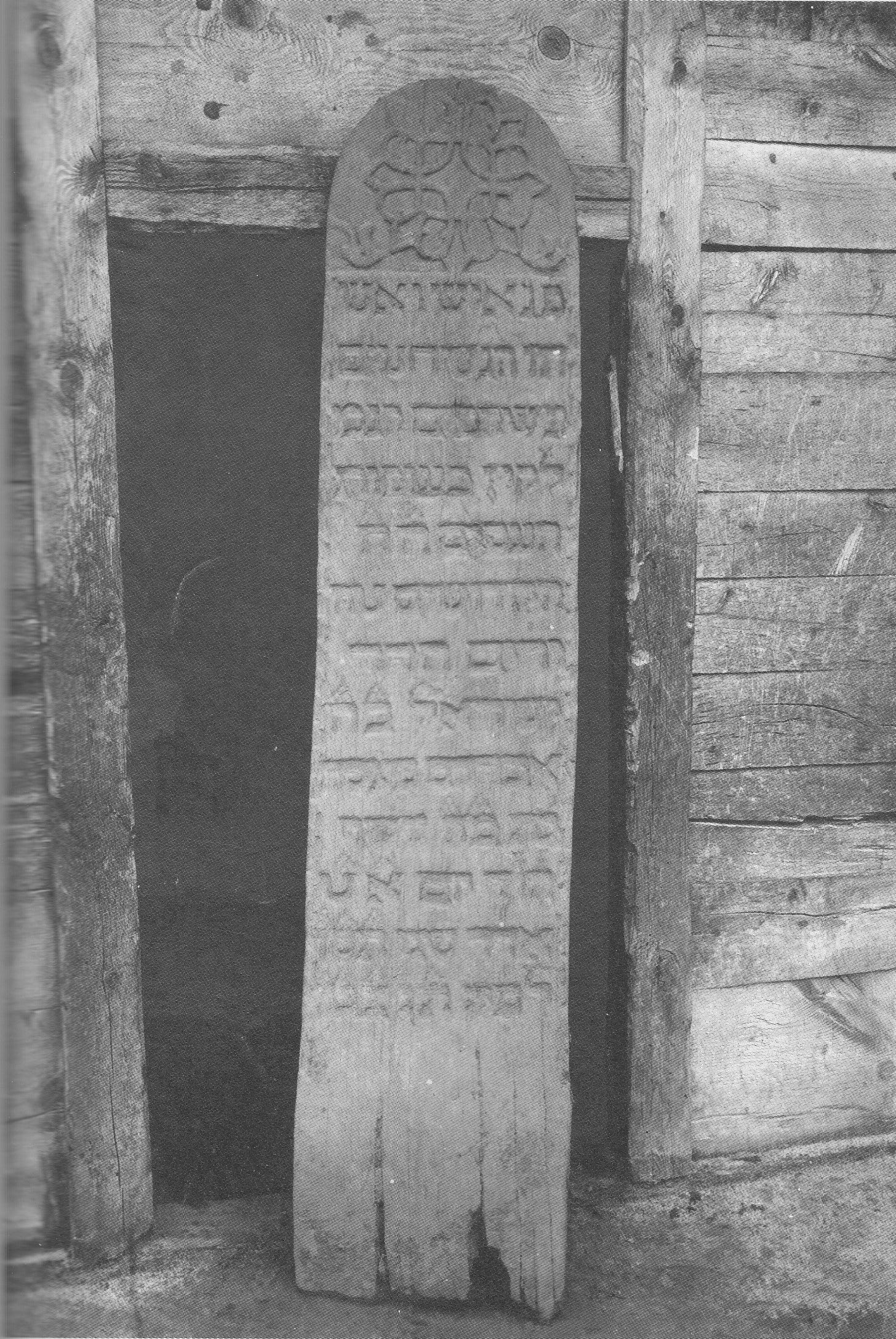
First, he banned the pictures of non-kosher animals1, that appear on thousands Matzevahs, Torah Arks, Torah itself, folklore, even Jewish names, and then he went after the iconic symbols. The Jews don’t have a vast visual tradition, so if you're bound on destruction, there are two or three easy targets.2
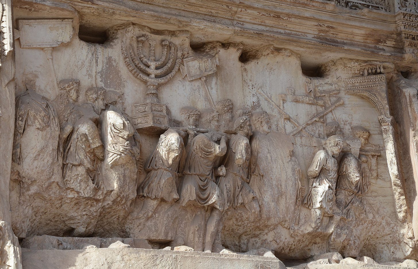
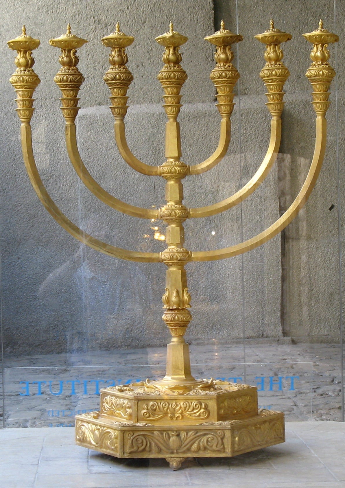
Every Chanukah, Chabad automatons saturate the visual space of the holiday with the ubiquitous, depraved, angled, illuminated sticks. They come to defile the holy vessels, to suffocate our visual identity, to force us to silently acquiesce to the devastation, to numb our taste while they carry out, hide and destroy the treasures of the Temple. They reenact the horror that preceded Chanukah together with the dread of the procession depicted on the Arch of Titus, synchronized in the annual loop.
In America, there is a hundred-year mission to unite all December celebrations into one “Happy Holidays!” Breaking the traditional curvature, it celebrates all the messianic eruptions.
Curvature and Cubism
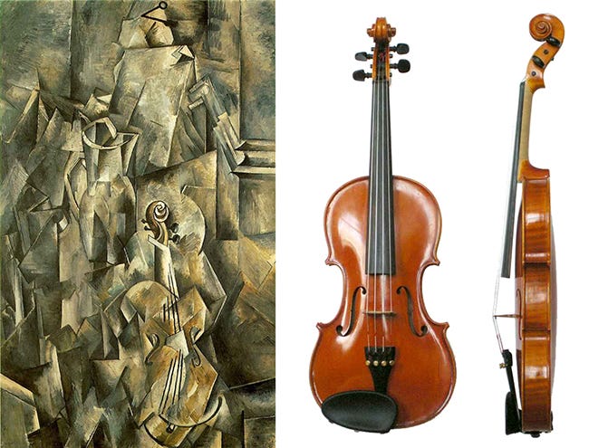
Cubism was one of the early modernist attempts to deconstruct beauty. The curves are reduced to geometric planes and angles. It ultimately was a step towards modernist architecture.
Purveyors of this style hated the curves and hated the feminine.
Geometric Modernism in Architecture
Modernism in turn destroyed the urban environment by drowning the city dwellers in the overpowering tsunami of the mangled glass, glare and the naked grayness of the industrial concrete. It was reengineered.
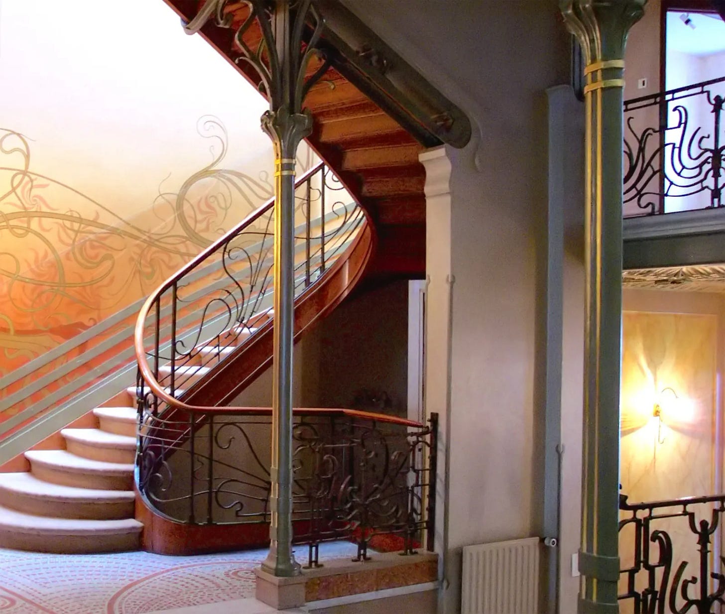
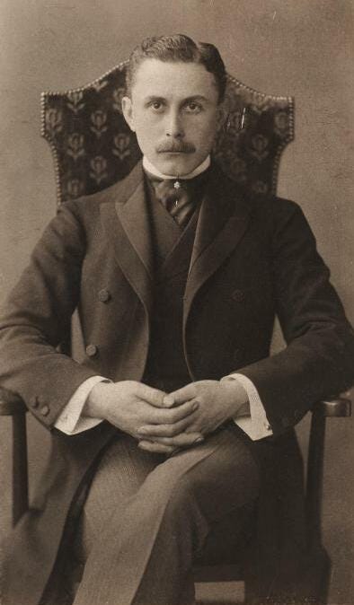
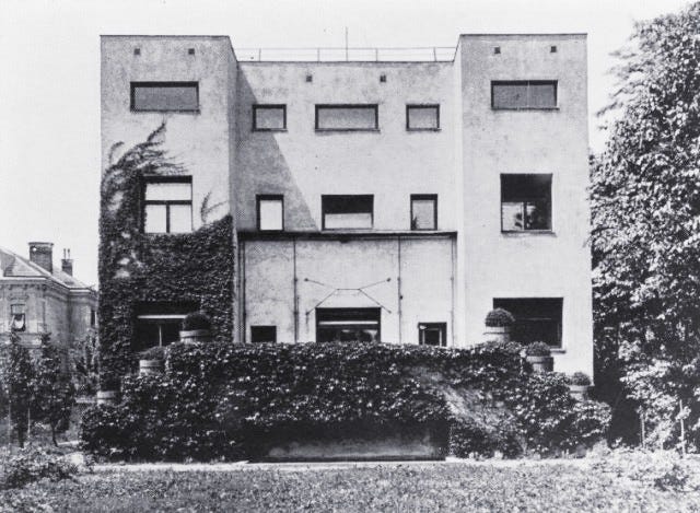
As I mentioned in the post about Yudovin’s Matzevahs, a Viennese architect named Adolf Loos wrote a mad manifesto that started and startled modern architecture. He wrote a little pamphlet named “Ornament and Crime”. He lauded the simple plane and the smooth surface of the wall.
The Jewish publisher and intellectual Karl Kraus used his pen to support Adolf Loos. Karl Kraus was also the sole author of the most popular in Vienna “blog” Die Fackel. Karl Kraus was a professional contrarian thinker. He advocated Jewish assimilation and opposed the other Viennese publisher, Theodor Herzl.
Adolf Loos’ argument had an economic, socialist component. He ultimately attacked multigenerational craftsmen guilds, claiming that only the rich could afford decorations. The skills, acquired and transferred from generation to generation, were lost forever. Industrialization, the engineer’s thinking, came to stake a claim on beauty and suppress the “curves”. And because fin-de-siècle Vienna was the cultural leader, the industrial style innovation was quickly mimicked, from Bauhaus in Berlin to Vkhutemas in Moscow.
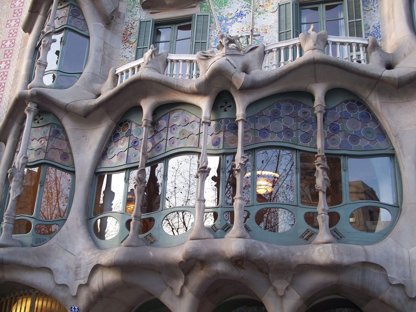
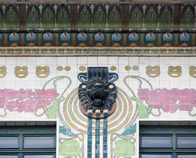
Adolf Loos hated and fought the curves of Art Nouveau (Jugendstil in Austria and Germany, Art Deco in America). Oh, those degenerate, feminine curves and decorations. How could they compare to the pure beauty of the clean, rectangular wall?
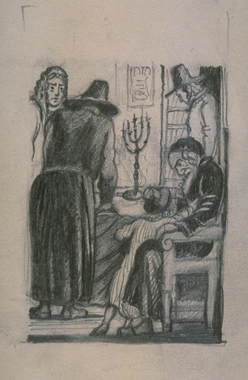
The Burning of the Traditional Menorah
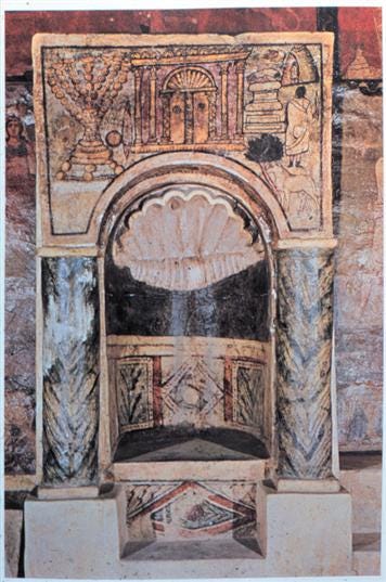
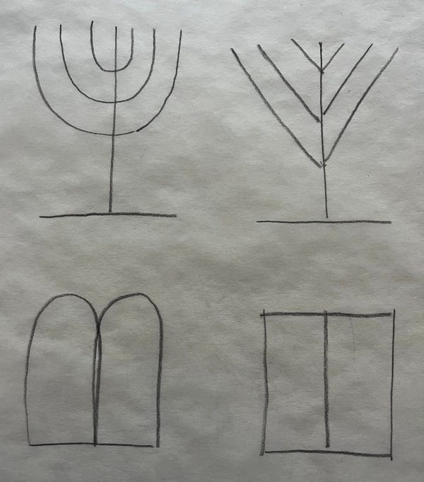
There is a smart utility to the traditional menorah, as the arms curve to the top, they support and balance the oil cups or the candles at the correct right angle. The unresolved design issue for the angled menorah.

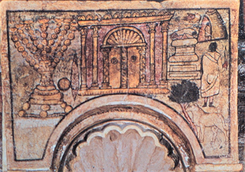
The arms of the menorah are of equal length, not like the Chabad design, where the top arms are shorter than the bottom arms. If you imagine a fire at the tip of those equal in length arms, it will actually burn the oil cup on top of it. In other words, this is only a diagram. The significant Chabad design modification of the unequal in length arms is certainly not in this picture. The base is a semi-sphere, which also appears to be shown diagrammatically.
There are many depictions of the traditional menorah, and only two with the straight arms. One is the sketch by Rambam (or some that helped him), and the second is a fresco in Dura-Europos. A town on the Euphrates river now in Eastern Syria. The frescoes date to approximately the 3rd century. The sketch, to the middle of the 12th century.
The Breaking of the Tablets
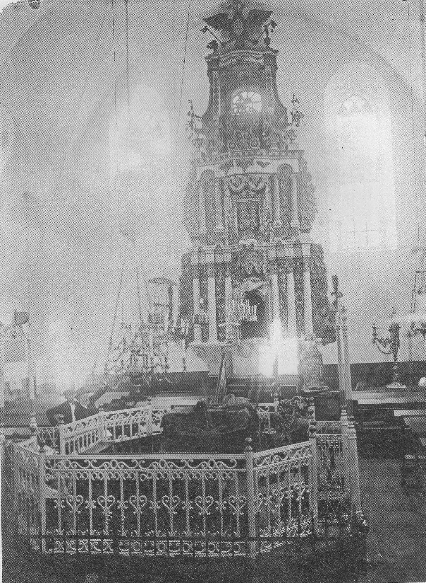
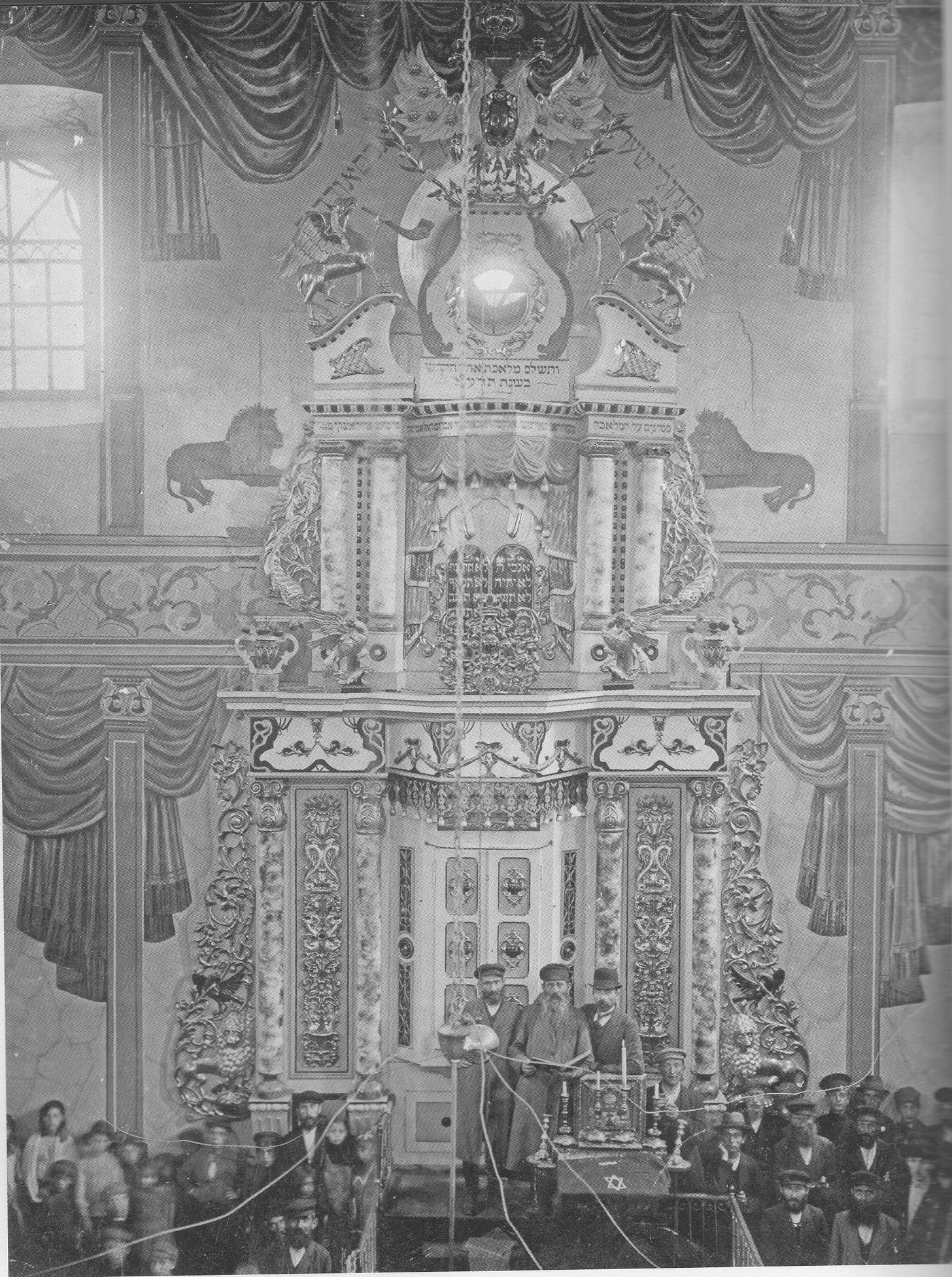
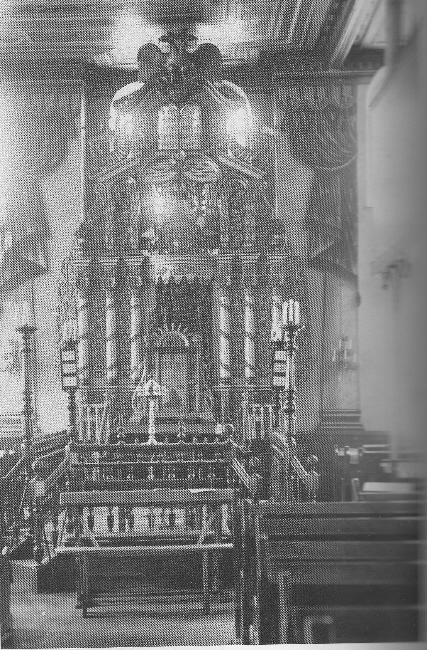
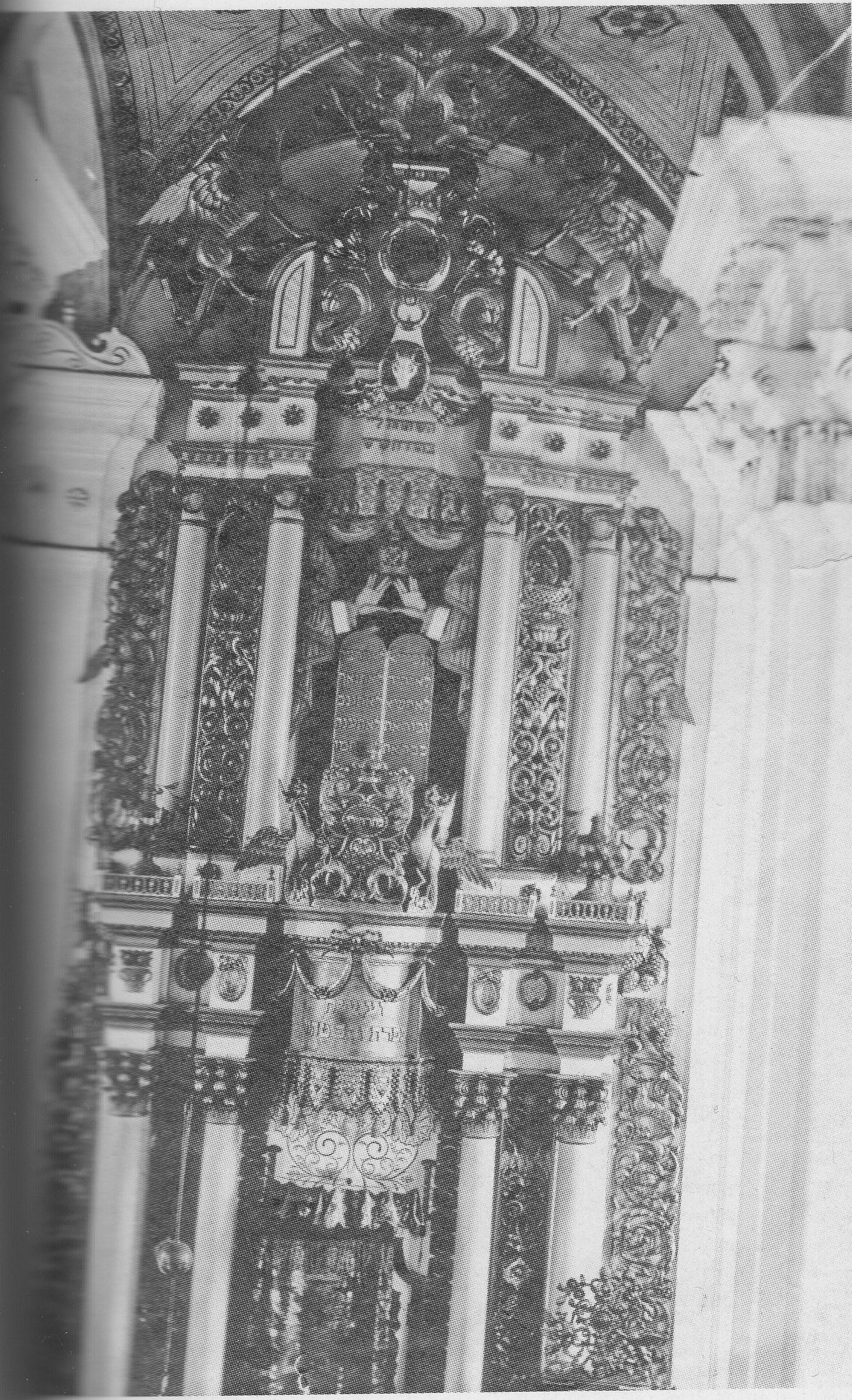
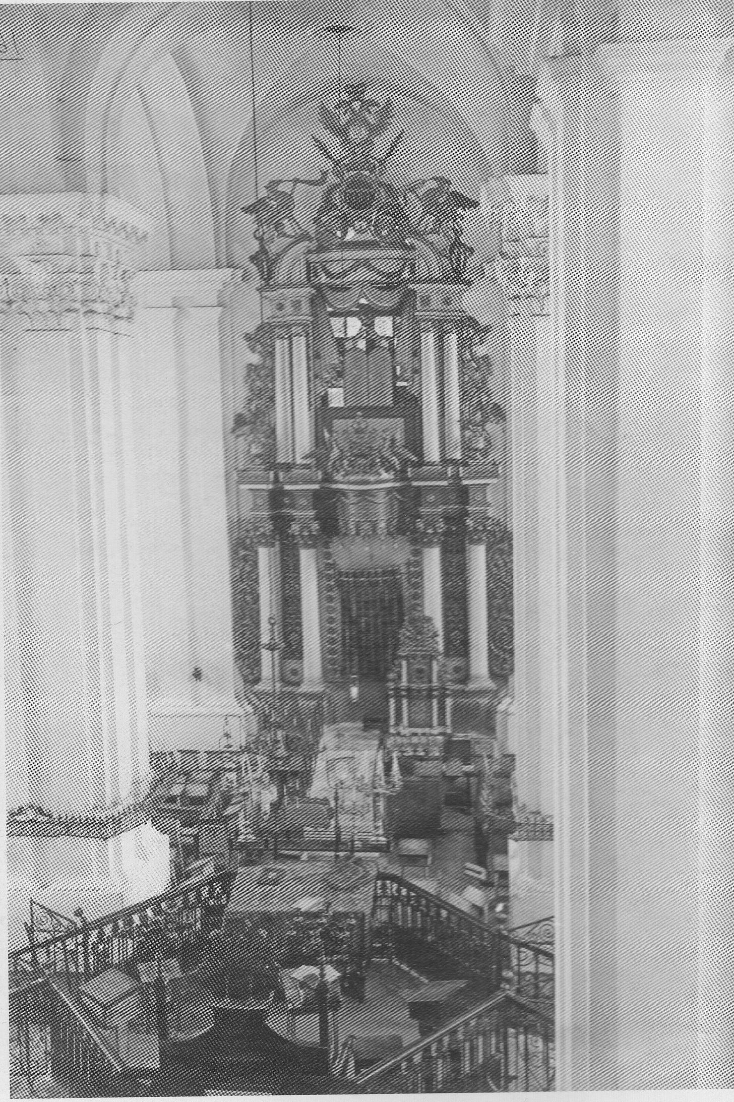
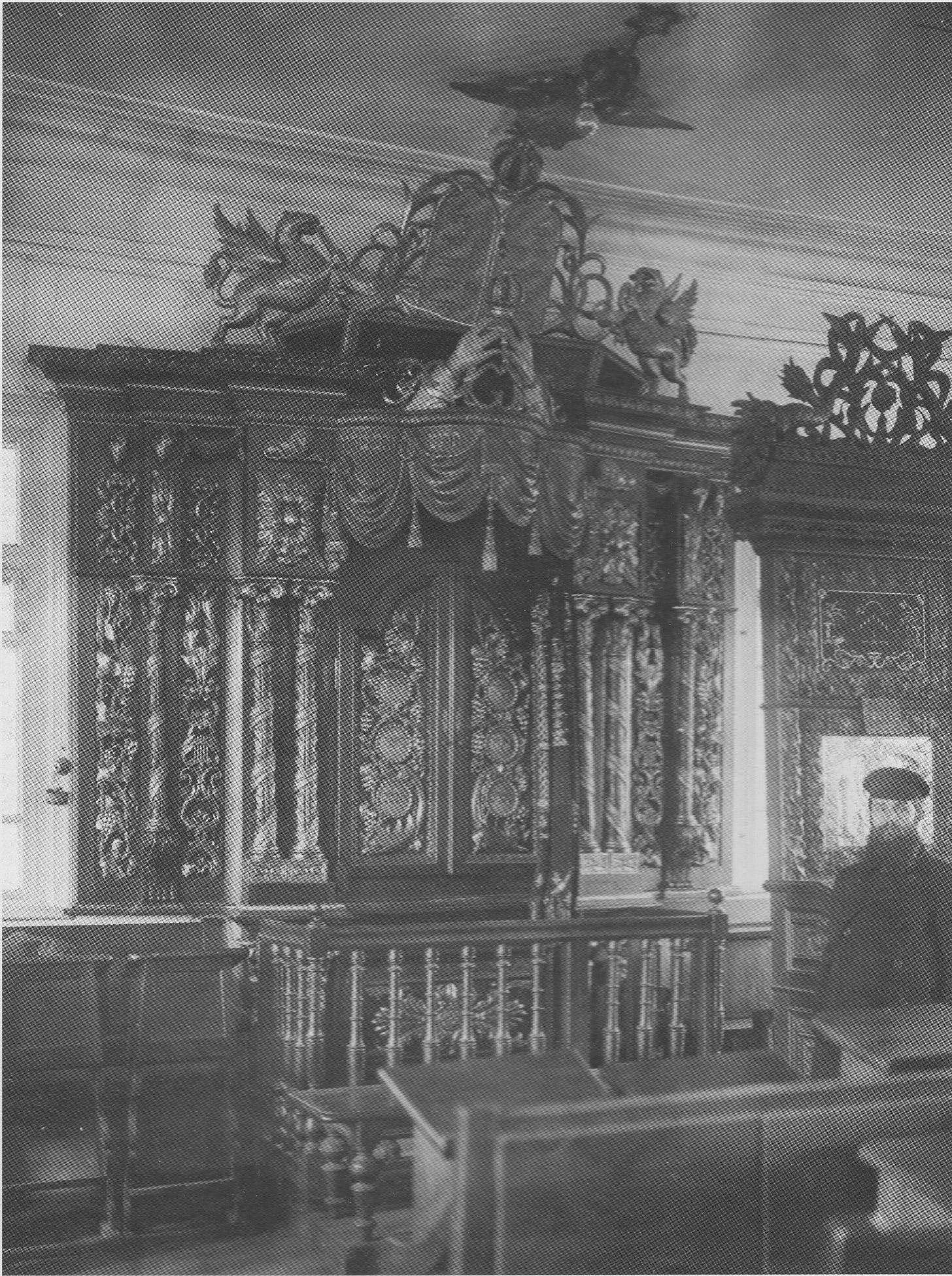
I will let the following photographs speak. All from the An-sky expedition of 1912-14 that we already wrote about. All photos by Shlomo Solomon Yudovin, bless the man and bless his teacher Yehuda Pen.
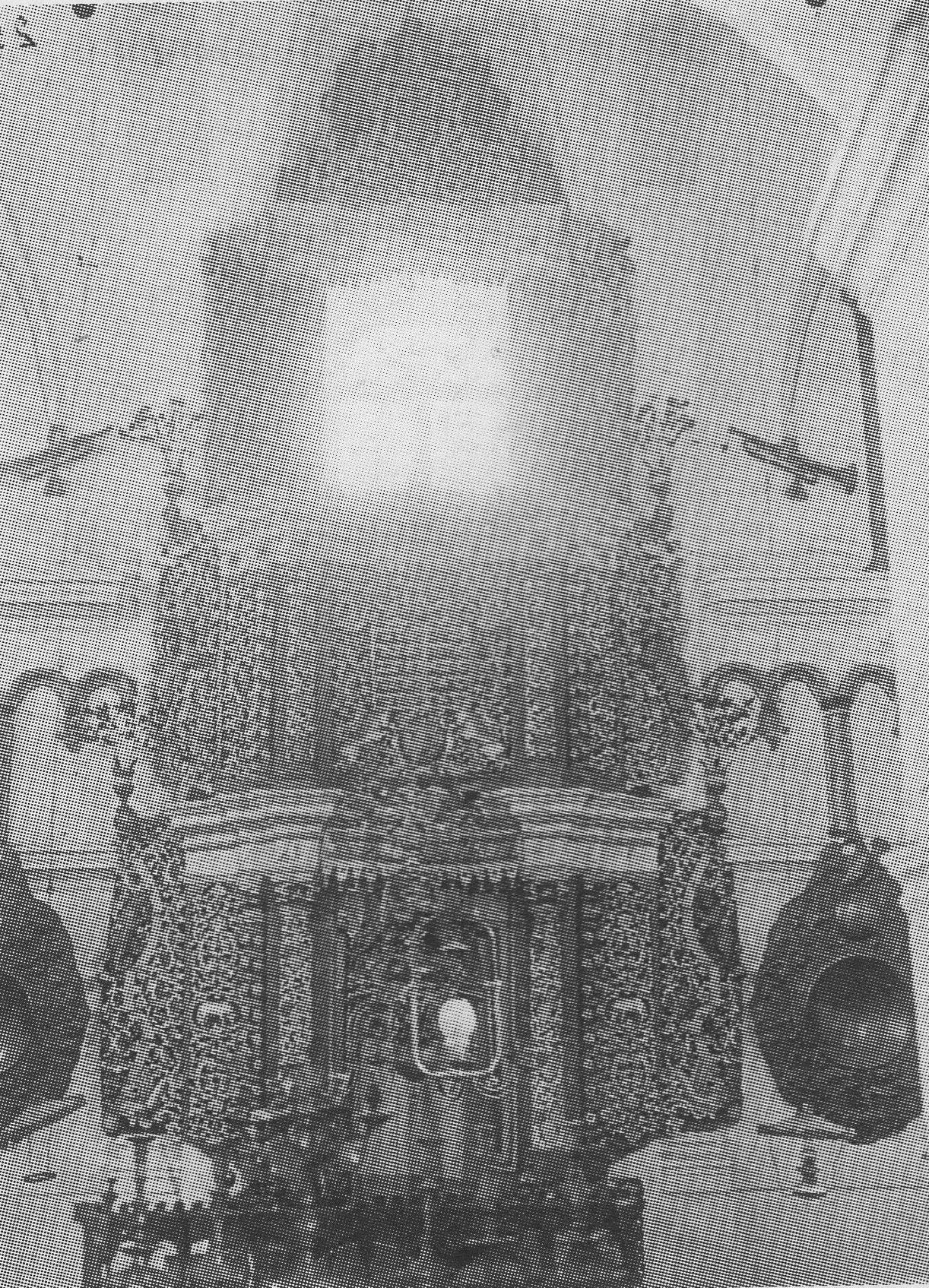
These shules operated on candlelight. Giant chandeliers suspended from the ceiling with chains. In this picture, An-sky is seen on the left, he is seen pulling aside the chandelier with his cane, so S. Yudovin can have a clear shot of the ark. Yudovin had a challenging task of taking the photo against the light of the enormous windows.3
But what a magnificent space! With the candlelight, it must have been absolutely magical.
It would take a craftsmen crew of professional carvers several years to design and carve this ark. You might be asking where are the traditional tablets, the luchos? The lead designer of the crew wanted to make something especially cool and unique. So the tablets are curved along the vertical axis, like a drum. You can see them on the “2nd story” of this structure.
The two-headed imperial eagle on top of the ark. The Tzars, who considered themselves the third Rome, borrowed the two-headed eagle from the Byzantine Empire. The Byzantine in turn adopted the heraldic symbol of the Palaeologus Greek dynasty.
This was only a hundred years ago, and in that century we lost every tribal legacy of the Jewish civilization. The blows by Nazis, Communists, Modernity, and assimilation were mortal. And then we had the leaders who, in addition to not having the taste in aesthetics, cared for the cult but not the cult-ural past.
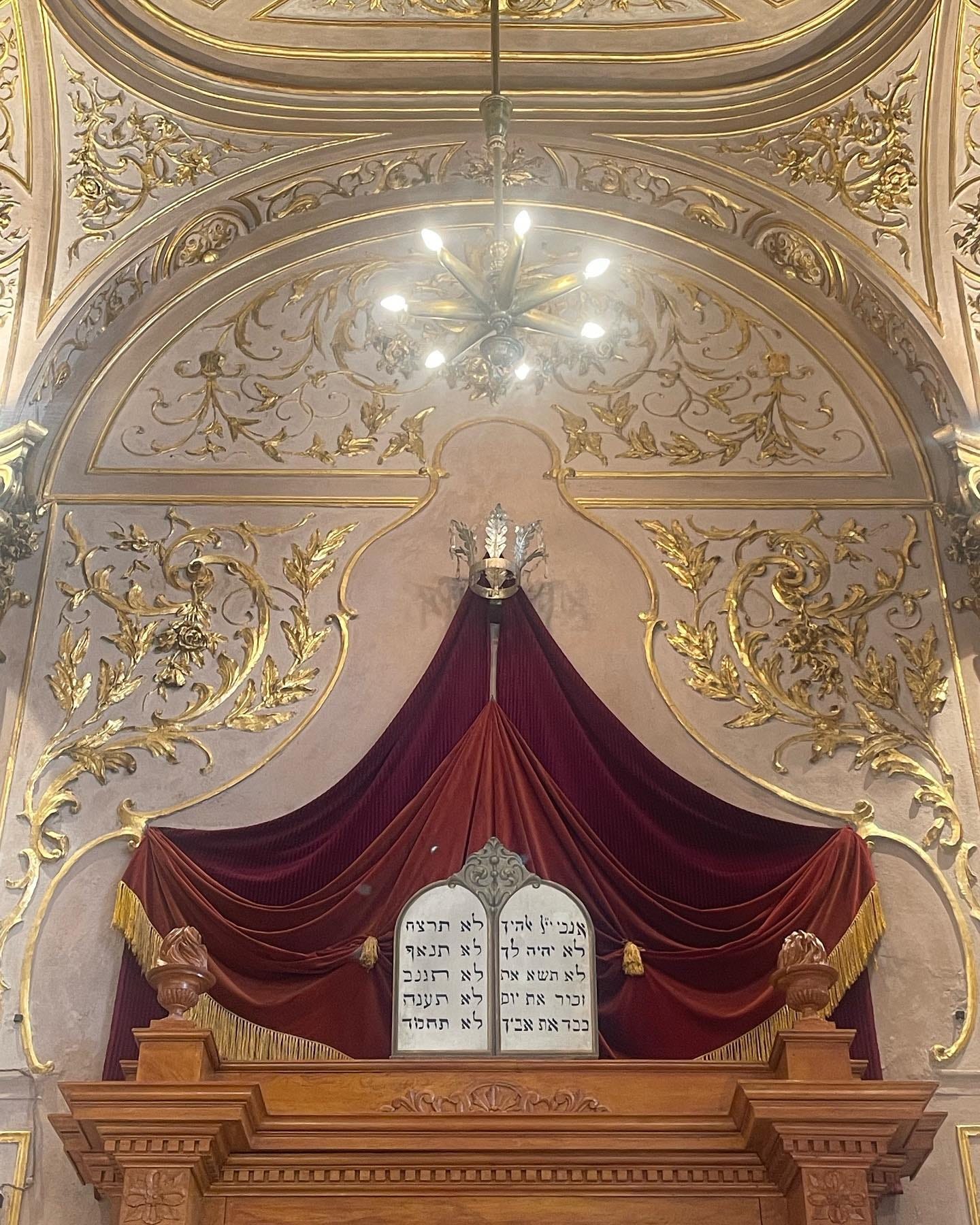
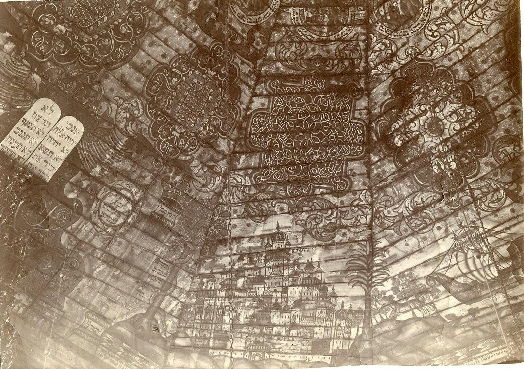
This was mostly gentile crews of carvers, and they clearly borrowed some elements from their Church experience. And the Jews would not know the difference. But the tablets in every shule, consistently, the central symbol. The Jews are makpid on far less significant masorah.
They run out of the height for the eagle on top. Not problem, let eagles fly!
Compare craftsmanship to the “paint by numbers” Lipsker’s Aron in 770. Which is a different color geometric pieces of wood glued to a flat box.
Again, you see on the left An-sky umbrella? Holing the chandelier to the side so Yudovin can have a clear shot. This one I think has two pairs of the tablets. Look carefully.
Note the box full of sand on the left. The plates are reflector plates, like the examples here. The box of sand is where they would put the candles for the reflected light.
Update:
Acknowledgements:
Photographing the Jewish Nation: Pictures from S. An-sky's Ethnographic Expeditions.
The Russian Museum of Ethnographic History - Jews. 1912–1914s. Photographs from the Ethnographic Expedition of S. A. An-sky.
Some say he was upset at Mendy the Mouse.
Mogen Dovid is a relatively new Jewish symbol not recognized by Chabad. Nevertheless, Mogen Dovid miraculously escaped the utilitarian mutilation, as the Star of David AKA the Seal of Solomon has no curves available for the chopping.
The Blank Family, the Jewish ancestors of Vladimir Lenin, are the vodka-franchisers, meshumodim from Starokonstantinov.




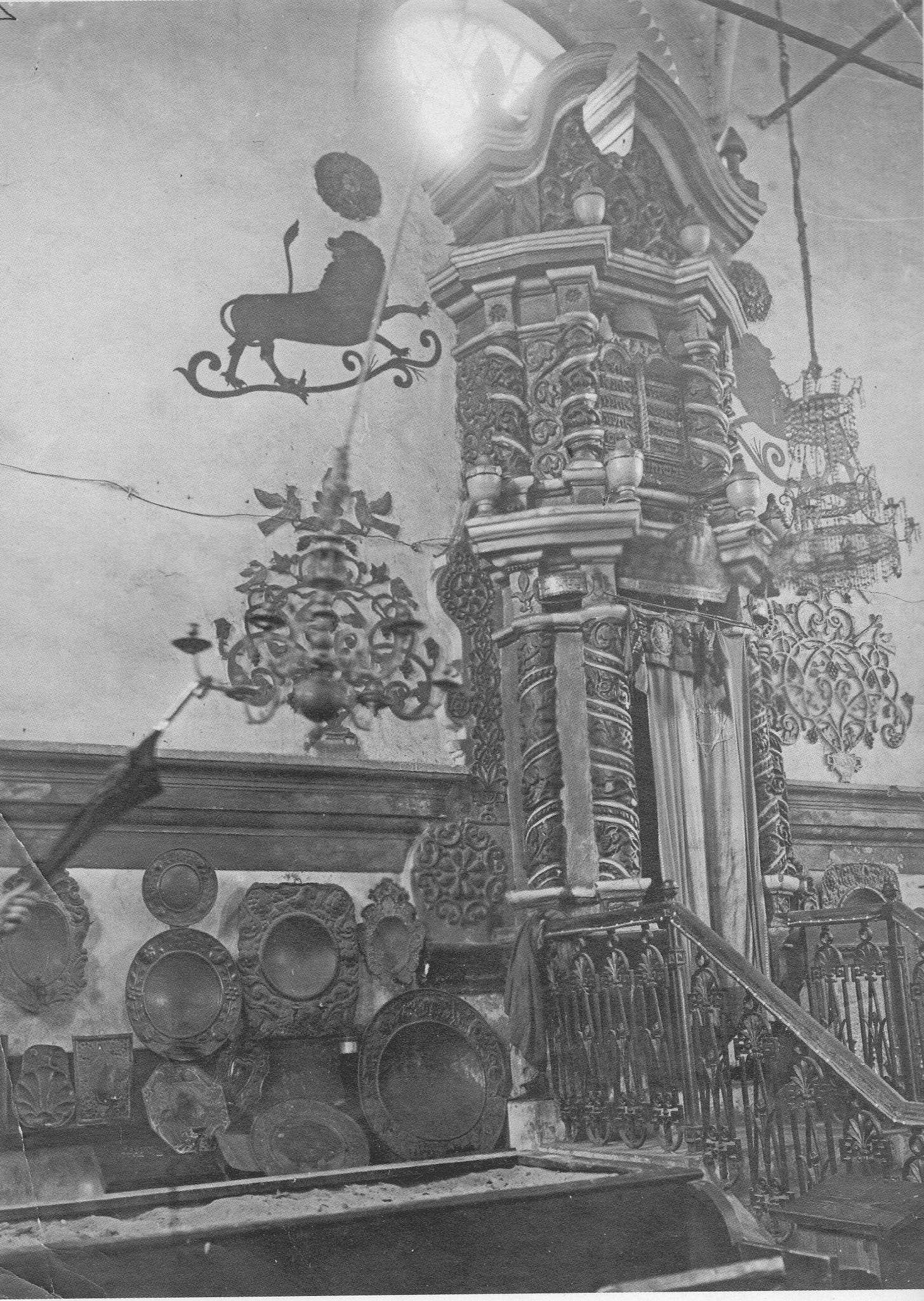
"Luboml. Interesting plates on the left."
These plates are simply reflectors design to project light towards the congregants.
Just recently I saw this type of plates in the Altneu Shul in Prague.
A collection of similar plates can be found here:
https://cja.huji.ac.il/search.php?submited=submited&free_text=reflector
in my view you are incorrect in attributing the the round menorah to the more traditional aesthetics than the diagonal one. this is not about "curves" (ala Art Deco), but about geometry. a pure round menorah is just as "Bauhaus" as the diagonal one, only much better designed.